
How to Create and Customize Your Cart Drawer (Overview Guide)
Welcome to Snap Cart Drawer!
The Cart Editor is your central creative studio. Here, you can design your cart drawer, customize its colors, enable or disable features like progress bars or countdown timers, and manage checkout behaviors. Best of all, you can customize everything visually without needing any technical skills.
This guide provides a complete overview of how to create, edit, and navigate your cart drawer settings.
1. How to Get Started: Editing and Creating Carts
When you install Snap Cart Drawer, the app automatically sets up a Default Cart for you.
- To edit your main cart: Go to the App Dashboard and click Edit on the Snap Cart Drawer card.
- To create multiple carts: If you want to show different cart designs or offers for different markets/countries, click the + Add cart button under the Multiple Carts section.

2. Understanding the Cart Editor Layout
Once you enter the Cart Editor, the screen is divided into three main areas:
- Left Sidebar: This is your control panel. You can toggle switches on or off to enable/disable widgets, and click on any widget name to open its settings.
- Middle Settings Panel: Displays the detailed settings, text fields, and configurations for the active widget selected in the left sidebar.
- Right Live Preview: Shows a real-time preview of your cart drawer. You can toggle between the Desktop and Mobile icons at the top to see how your cart looks on different screens.
3. The Two Cart States: "Item in Cart" vs. "Empty Cart"
At the top of the Left Sidebar, you can switch between two configuration tabs:
- Item in Cart: Customize what the cart looks like when a customer has added products.
- Empty Cart: Customize what the cart looks like when a customer opens it with 0 items.
4. GENERAL Settings: Styling & Behavior
The GENERAL section controls the overall appearance and behavior of your cart drawer.
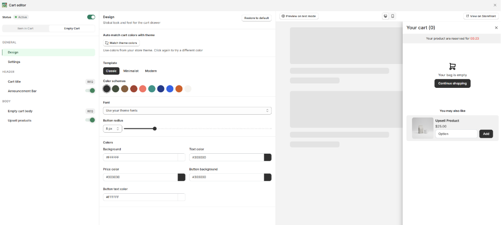
Design Tab
Click on Design to set up your store's style guidelines:
- Match colors automatically with your theme.
- Choose a template style (Classic, Minimalist, or Modern).
- Customize fonts, button corner roundness (Button radius), background colors, and button text colors.

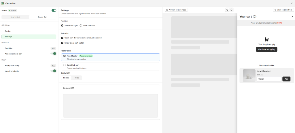
Settings Tab
Click on Settings to configure the global cart behaviors:
- Position: Choose whether the drawer slides in from the left or right of the screen.
- Behavior: Toggle whether to open the drawer automatically when a product is added, and whether to show the "Clear cart" button.
- Footer style: Set a Fixed footer (checkout button always visible at the bottom) or Scroll full cart (footer scrolls with items).
- Cart width: Choose a Normal or Wide layout.
- Custom CSS: Input custom styling rules if you want to make advanced adjustments.

5. HEADER Settings: The Top of Your Cart
The HEADER widgets appear at the top of your cart drawer.
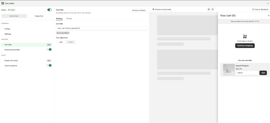
Cart Title
Configure your cart's main header text:
- Customize the title wording (e.g., using the
{{(cart_quantity)}}placeholder to show item count). - Set the text alignment (Left or Center).

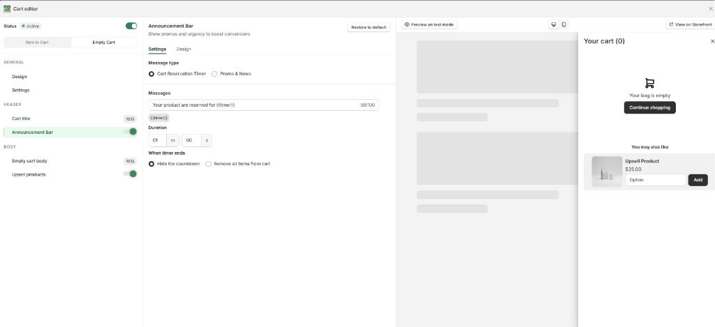
Announcement Bar
Display urgent notes or marketing messages to capture attention:
- Choose between Cart Reservation Timer (to create urgency) and Promo & News.
- Customize the message, timer duration, and what happens when the timer ends (hide countdown or empty the cart).

Reward Progress Bar
Show customers how close they are to unlocking incentives (like free shipping or discounts):
- Select target measurements (cart value or item quantity).
- Create multiple tiers (e.g., Tier 1: Free Shipping at USD 100, Tier 2: 10% Discount at USD 200).
- Customize the messages shown as shoppers get closer to their goals.

6. BODY Settings: Cart Items & Add-Ons
The BODY section contains the items added to the cart and promotional add-ons.
Cart Items
Manage how your products are displayed inside the drawer:
- Toggle display details (show/hide vendor, SKU, unit price, stock left, comparison prices, and discount badges).
- Customize the "Save" label text and free gift text.
- Enable subscription upgrade offers if your store uses a subscription app.

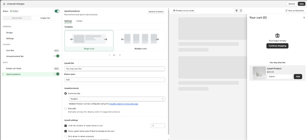
Upsell Products
Recommend complementary products to increase AOV:
- Select a layout style (Single card or Multiple card).
- Configure automatic recommendations (via Shopify Search & Discovery) or build custom manual rules.
- Set constraints (limiting item counts or hiding out-of-stock items).

Additional Note
Let shoppers leave instructions or special requests:
- Set custom titles and placeholder texts.
- Choose the text alignment and input box size (one-line or multi-line).

Order Add-Ons
Offer optional paid services directly in the cart drawer:
- Shipping protection: Offer shipping insurance.
- Gift wrapping: Offer a paid wrapping service.
- Product add-on: Suggest a small complementary accessory.

7. FOOTER Settings: Checkout & Trust Elements
The FOOTER widgets appear at the very bottom of the cart drawer.
Estimate Shipping Rate
Help reduce cart abandonment by letting customers estimate shipping fees:
- Set custom titles and estimate buttons.
- Configure the messages displayed when rates are found or unavailable.

Order Summary
Summarize costs and discount inputs clearly:
- Toggle the discount code input field.
- Define how subtotals and savings are labeled and calculated.

Checkout Actions
Customize the checkout button:
- Format the checkout button label.
- Set click behaviors (redirect to Shopify checkout page or standard cart page).
- Add express/accelerated checkout options (Shop Pay, Apple Pay).
- Configure third-party checkout integrations (e.g., GoKwik).

Confirmation Box
Require customers to agree to your terms before buying:
- Use the rich text editor to write your terms and agreement text.
- Choose whether the checkbox is ticked by default.

Trust Badge
Build trust and verify security:
- Select which payment icons to show from a list of credit cards and payment gateways.
- Alternatively, upload your own security seal or logo.
- Adjust icon size using the slider.

8. Customizing the "Empty Cart" State
When a customer opens their cart with 0 items, you want to show a helpful layout to get them shopping. Click the Empty Cart tab at the top of the Left Sidebar to configure this state:
Empty Cart Body
This is the core of your empty cart view. You can configure:
- The empty cart icon (cart, bag, box, shopping icons).
- The text message (e.g., "Your bag is empty").
- Enable a call-to-action button (e.g., "Continue shopping") and its redirection link.

Other Empty Cart Customizations
You can customize the other widgets specifically for the empty state to match:
- Design & Settings: Adjust colors and width.
-
Design:
Empty Cart Design
-
Settings:
Empty Cart Settings
-
- Cart Title & Announcement: Customize header texts specifically for empty carts.
-
Cart Title:
Empty Cart Title
-
Announcement:
Empty Cart Announcement Bar
-
- Upsell Products: Show recommended items even when the cart is empty, encouraging shoppers to add products immediately!
-
Empty Cart Upsell:
Empty Cart Upsell Products
-


Need More Help?
If you experience any issues or have questions, please don't hesitate to contact our support team at [email protected] or through our live chat - we're here to assist you!